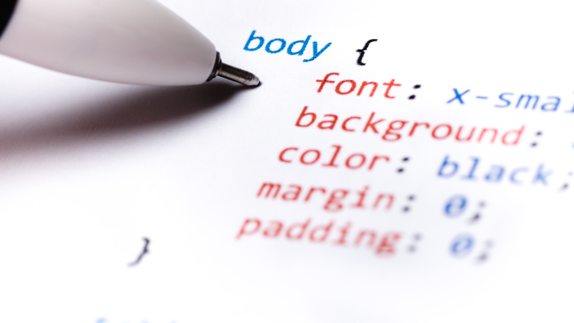
Cascading Style Sheets, commonly known as CSS, is a stylesheet language used to control the visual presentation of web documents, including HTML and XML.
CSS allows you to define the layout, colors, fonts, and other visual aspects of a webpage. It separates the structure and content of a web page (usually defined in HTML) from its visual style and layout.
Note: Get Your CSS Cheat Sheet PDF Below.
How Does CSS Work?
CSS works by selecting HTML elements using selectors and then defining properties and values to style those elements. It follows rules of cascade and specificity to determine which styles take precedence. The box model controls the size and spacing of elements, and some properties can be inherited from parent elements.
CSS is essential for creating responsive designs and can be applied externally, internally, or inline in HTML. Browsers use CSS during the rendering process to display web content.
What is CSS?
CSS code is typically placed in a separate file with a .css extension. For example, you might create a file named “styles.css” to store your CSS code.
- Linking CSS to HTML: To apply CSS to an HTML document, you need to link the CSS file to your HTML file. You can do this by adding a <link> element in the <head> section of your HTML document. Here’s an example:
<link rel=”stylesheet” type=”text/css” href=”styles.css”>
- Selectors: CSS selectors are used to target HTML elements that you want to style. For instance, to target all <p> (paragraph) elements, you can use the following selector:
p {
/* CSS rules go here */
}
- Properties and Values: Within a CSS rule block, you define the properties and values that you want to apply to the selected elements. For example:
p {
color: blue;
font-size: 16px;
}
In this example, the color property sets the text color to blue, and the font-size property sets the font size to 16 pixels.
- Comments: You can add comments in your CSS code using the /* */ syntax. Comments are ignored by the browser and are useful for adding explanations or notes to your code.
/* This is a CSS comment */
- Cascade and Specificity: CSS follows a set of rules to determine which styles should be applied when multiple conflicting styles are defined. The cascade and specificity rules help prioritize styles.
- Box Model: The CSS box model defines how elements are rendered on a webpage. It includes properties like width, height, padding, margin, and border that control the size and spacing of elements.
- Classes and IDs: You can target specific elements using classes and IDs. Classes are defined with a leading period (e.g., .my-class) and can be used on multiple elements. IDs are defined with a leading hash (e.g., #my-id) and should be unique to a single element.
- External, Internal, and Inline CSS: Besides external CSS files, you can also define CSS styles internally within an HTML document using the <style> tag or even inline within individual HTML elements using the style attribute. However, it’s generally best practice to use external CSS for maintainability and reusability.
CSS Grid Cheat Sheet PDF
Here’s a concise CSS Grid cheat sheet to help you get started with creating grid layouts:
Basic CSS Grid Setup
.container {

display: grid;

grid-template-columns: 1fr 1fr 1fr; /* Define columns */

grid-template-rows: 100px 200px;     /* Define rows */

gap: 10px;                          /* Set gap between grid items */

}grid-column: 1 / 3; /* Place the item in specific columns */
grid-row: 1 / 2; /* Place the item in specific rows */
}
Shorthand for Grid Template
.container {

grid-template: repeat(3, 1fr) / repeat(2, 1fr); /* Shorthand for columns and rows */

}
Creating Equal Width Columns
.container {

display: grid;

grid-template-columns: repeat(auto-fit, minmax(200px, 1fr)); /* Equal width columns */

gap: 10px;

}
Creating a Grid Area
.container {

display: grid;

grid-template-columns: 1fr 1fr;

grid-template-rows: 1fr 1fr;

}grid-area: 1 / 1 / 2 / 3; /* Starts at row 1, column 1, ends at row 2, column 3 */
}
Centering Grid Items
.container {

display: grid;

justify-content: center; /* Horizontally center items */

align-items: center;     /* Vertically center items */

}
Creating Grid Gaps
.container {

gap: 20px; /* Set gap between grid items */

}
Auto Placement
.container {

display: grid;

grid-auto-flow: dense; /* Fills empty spaces efficiently */

}
Grid Line Names
.container {

grid-template-columns: [col1] 1fr [col2] 1fr [col3]; /* Define named grid lines */

grid-template-rows: [row1] 100px [row2] 200px [row3];

}grid-column: col1 / col3; /* Use named grid lines to place items */
grid-row: row1 / row2;
}
This cheat sheet covers some of the fundamental CSS Grid properties and techniques. You can customize and expand upon these concepts to create more complex grid layouts for your web projects.
Note: Get Your CSS Cheat Sheet PDF Below.
CSS Commands List
CSS (Cascading Style Sheets) doesn’t have “commands” in the traditional sense. Instead, it uses properties and values to define styles for HTML elements. Here’s a list of common CSS properties and their purposes:
- color: Sets the text color.
- font-family: Defines the font to be used for text.
- font-size: Specifies the size of the text.
- font-weight: Controls the thickness of the font.
- background color: Sets the background color of an element.
- text-align: Aligns text horizontally (left, center, right, etc.).
- text-decoration: Adds underlines, overlines, or strikes through text.
- text-transform: Changes the capitalization of text (uppercase, lowercase, etc.).
- Line height: Adjusts the spacing between lines of text.
- Letter spacing: Controls the spacing between characters.
- margin: Sets the margin space around an element.
- padding: Defines the padding space inside an element.
- border: Styles and positions the border around an element.
- width: Sets the width of an element.
- height: Defines the height of an element.
- display: Specifies how an element is displayed (block, inline, flex, grid, etc.).
- position: Controls the positioning of an element (static, relative, absolute, fixed).
- float: Determines how elements should float within their container.
- clear: Clears the floating elements to ensure proper layout.
- z-index: Manages the stacking order of elements.
- overflow: Defines how content should behave when it overflows the element.
- text-overflow: Handles text that overflows its container.
- white-space: Controls how white space inside an element is handled.
- box-sizing: Specifies how the element’s total width and height are calculated.
- list-style: Styles for list elements (list-style-type, list-style-position, list-style-image).
- text-shadow: Adds a shadow to text.
- box-shadow: Adds a shadow to an element.
- border-radius: Sets the rounded corners of an element.
- background-image: Defines an image as the background of an element.
- background-size: Specifies the size of the background image.
- background-position: Positions the background image.
- transition: Creates smooth transitions between property changes.
- transform: Applies 2D or 3D transformations to an element.
- animation: Animates elements using keyframes.
- flexbox properties: Properties like
flex,justify-content,align-itemsfor a flexible layout. - grid properties: Properties like
grid-template-columns,grid-template-rows,grid-gapfor grid layouts.
These are just a selection of commonly used CSS properties. CSS is a vast language, and there are many more properties and values available for styling and layout.


